Analyzing Clustering Output
The clustering floes provide many ways for users to cluster molecules based on their 2D or 3D similarity. This tutorial describes basic analysis of any of the clustering floe output datasets.
Floes used in this Tutorial
This tutorial applies to analyzing the output of any of the following floes:
Clustering Floe Report
The clustering floe will provide a clustering report that gives a high-level overview of the data. This report will show the number of molecules in each cluster, and also provide an image of a representative molecule for each cluster. It will also show the clustering settings set by the user. Below is an example report. Clicking on an image of a representative molecule will allow you to view all the molecules in that cluster.
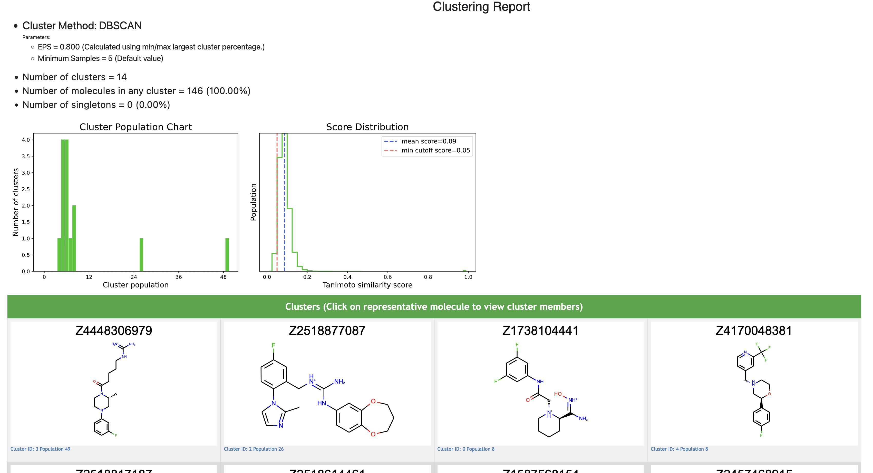
Clustering Report
View Cluster Data in the Analyze page
The following steps show how to analyze data further using the Orion analyze page:
From the JOB tab, click “Show in Project Data” next to the dataset named <Clustering Type> Members.
Click the + icon next to the dataset you wish to view in the Analyze page (Cores, Members, or Singletons). Cores will contain one representative molecule per cluster. Members will include all cluster members. Singletons will contain outliers (for DBSCAN) or clusters with a single member (for other clustering floes).
Click the Analyze tab in the left-most pane.
The Spreadsheet tab can be used to sort properties of the dataset, such as the Cluster ID.
The plot tab above the spreadsheet can be used to compare properties in a scatter plot, box plot, violin plot, or histogram. These plots unfortunately cannot plot cluster IDs. To analyze and plot based on a cluster ID, download the output dataset and retrieve the cluster ID field from each record to use in plots.
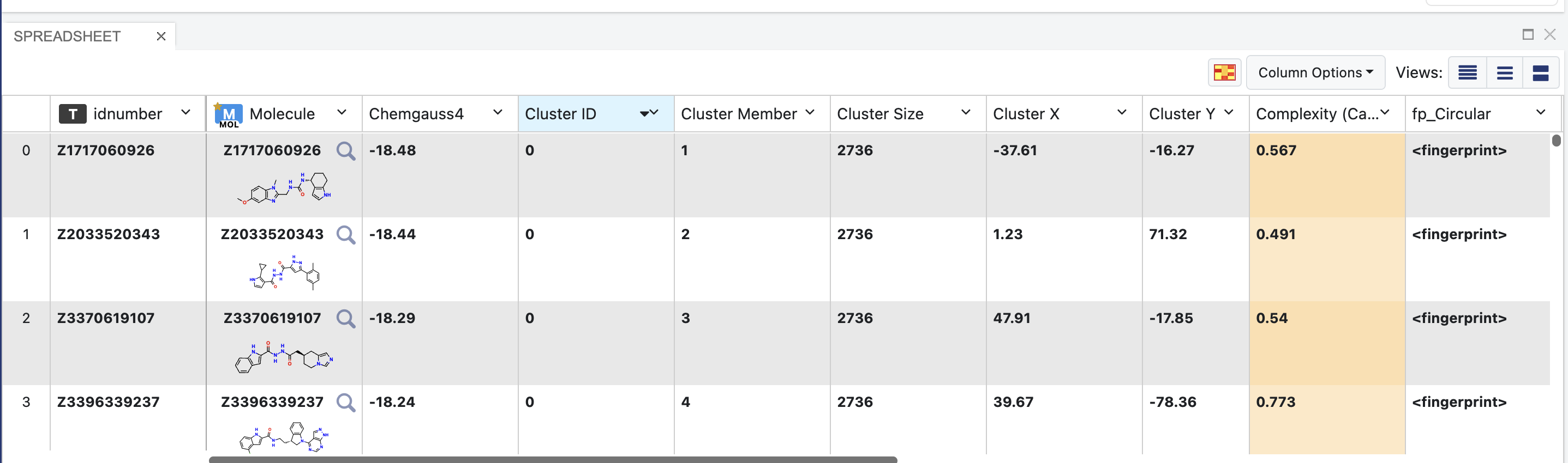
Spreadsheet of Cluster Members Output Dataset
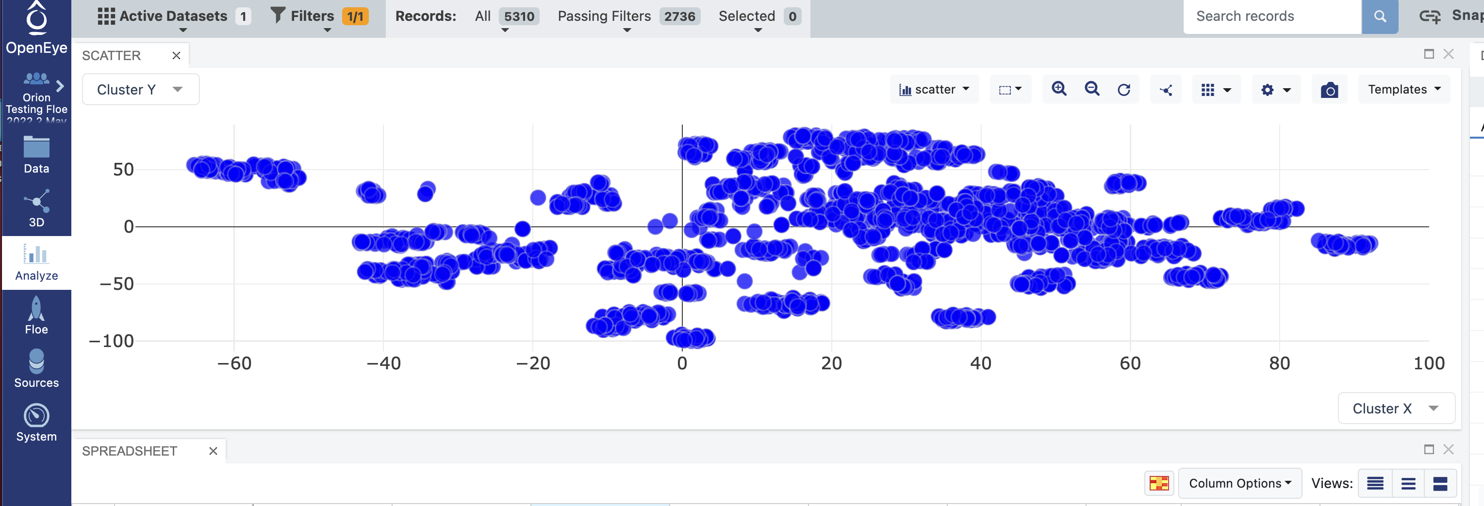
View A Scatter Plot of the Clustering Data
In the plot tab above the spreadsheet, select “scatter” as the plot type.
For the X axis label, select Cluster X. For the Y axis label, select Cluster Y.
Select the Plot Options icon at the upper right of the plot. Then select the Color tab in this menu. Under Color dimension, select Cluster ID. Your scatter plot should now display a visualization of the data.
Other dimensions can be visualized by adjusting the size, color, or marker of points on the plot. Cluster ID cannot be visualized this way: please download output data for visualization of cluster ID.
To view specific clusters, select the Filters Tab at the top of the page, and filter by cluster ID. Select “Exact Match” and enter the ID of the cluster you wish to view.
Scatter Plot of Single Cluster Selected through Filter