Drawing ROC Curve
Problem
You want to draw a ROC curve to visualize the performance of a binary classification method (see Figure 1).
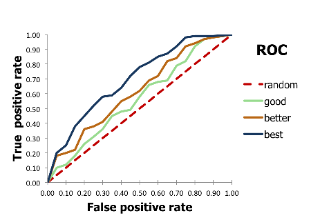
Figure 1. Example of ROC curves
Ingredients
|
Difficulty level
🌶️ 🌶️
Download
Source Code
roc2img
#!/usr/bin/env python3
# (C) 2026 Cadence Design Systems, Inc. (Cadence)
# All rights reserved.
# TERMS FOR USE OF SAMPLE CODE The software below ("Sample Code") is
# provided to current licensees or subscribers of Cadence products or
# SaaS offerings (each a "Customer").
# Customer is hereby permitted to use, copy, and modify the Sample Code,
# subject to these terms. Cadence claims no rights to Customer's
# modifications. Modification of Sample Code is at Customer's sole and
# exclusive risk. Sample Code may require Customer to have a then
# current license or subscription to the applicable Cadence offering.
# THE SAMPLE CODE IS PROVIDED "AS IS", WITHOUT WARRANTY OF ANY KIND,
# EXPRESS OR IMPLIED.  OPENEYE DISCLAIMS ALL WARRANTIES, INCLUDING, BUT
# NOT LIMITED TO, WARRANTIES OF MERCHANTABILITY, FITNESS FOR A
# PARTICULAR PURPOSE AND NONINFRINGEMENT. In no event shall Cadence be
# liable for any damages or liability in connection with the Sample Code
# or its use.

"""Plot ROC curve from actives list and scored molecules."""

import argparse
import os
import pathlib
import sys
from operator import itemgetter
from pathlib import Path

import matplotlib.pyplot as plt
from rich.console import Console
from rich_argparse import HelpPreviewAction, RichHelpFormatter
from sklearn.metrics import auc

__SCRIPT_NAME__ = pathlib.Path(__file__).absolute().stem
__SCRIPT_DESC__ = "Plot ROC curve from actives list and scored molecules."
__SCRIPT_TOOLKITS__: list[str] = []


def parse_options() -> argparse.Namespace:
    """Set up command line options."""
    parser = argparse.ArgumentParser(
        add_help=True,
        formatter_class=RichHelpFormatter,
        description="[yellow]" + __SCRIPT_DESC__ + "[/yellow]",
    )

    io_group = parser.add_argument_group("Input/output options")
    io_group.add_argument(
        "--actives",
        metavar="ACTIVES-FILE",
        type=str,
        required=True,
        help="input file with active molecule identifiers (one per line)",
    )
    io_group.add_argument(
        "--scores",
        metavar="SCORES-FILE",
        type=str,
        required=True,
        help="input file with molecule scores (label on first line, id score pairs)",
    )
    io_group.add_argument(
        "--image",
        metavar="IMAGE-FILE",
        type=str,
        required=True,
        help="output image file (png, svg, pdf)",
    )

    plot_group = parser.add_argument_group("Plot options")
    plot_group.add_argument(
        "--color",
        type=str,
        default="#008000",
        help="hex color code for the ROC curve (default: %(default)s)",
    )
    plot_group.add_argument(
        "--no-random-line",
        default=False,
        action="store_true",
        help="do not draw the diagonal random baseline",
    )

    parser.add_argument("--help-image", action=HelpPreviewAction)
    parser.add_argument(
        "--save-console-svg",
        default=False,
        action="store_true",
        help=f"run command and capture console output in {__SCRIPT_NAME__}.svg file",
    )
    return parser.parse_args()


def main() -> int:
    """Plot ROC curve."""
    args = parse_options()

    console = Console(record=args.save_console_svg)

    image_file = Path(args.image)
    if not _is_supported_image_type(image_file.suffix):
        console.print(f'[red]Format "{image_file.suffix}" is not supported![/red]')
        return os.EX_USAGE

    actives_file = Path(args.actives)
    actives = load_actives(actives_file)
    console.print(f"Loaded [green]{len(actives)}[/green] actives from {actives_file}")

    scores_file = Path(args.scores)
    label, scores = load_scores(scores_file)
    console.print(
        f"Loaded [green]{len(scores)}[/green] {label} scores from {scores_file}"
    )

    sorted_scores = sorted(scores, key=itemgetter(1))

    console.print("Plotting ROC Curve ...")
    depict_roc_curve(
        actives,
        sorted_scores,
        label,
        args.color,
        str(image_file),
        random_line=not args.no_random_line,
    )

    console.print(f"Saved ROC curve to [green]{image_file}[/green]")

    if args.save_console_svg:
        console.save_svg(f"{__SCRIPT_NAME__}.svg", title=__SCRIPT_NAME__)

    return os.EX_OK


def load_actives(filepath: Path) -> list[str]:
    """Load active molecule identifiers from a file."""
    with filepath.open() as f:
        return [line.strip() for line in f if line.strip()]


def load_scores(filepath: Path) -> tuple[str, list[tuple[str, float]]]:
    """Load scored molecules from a file."""
    with filepath.open() as f:
        label = f.readline().strip()
        scores: list[tuple[str, float]] = []
        for line in f:
            mol_id, score = line.strip().split()
            scores.append((mol_id, float(score)))
    return label, scores


def get_rates(
    actives: list[str], scores: list[tuple[str, float]]
) -> tuple[list[float], list[float]]:
    """Compute true positive and false positive rates."""
    tpr = [0.0]
    fpr = [0.0]
    num_actives = len(actives)
    num_decoys = len(scores) - num_actives

    found_actives = 0.0
    found_decoys = 0.0
    for mol_id, _score in scores:
        if mol_id in actives:
            found_actives += 1.0
        else:
            found_decoys += 1.0

        tpr.append(found_actives / float(num_actives))
        fpr.append(found_decoys / float(num_decoys))

    return tpr, fpr


def setup_roc_curve_plot() -> None:
    """Configure ROC curve plot axes and title."""
    plt.xlabel("FPR", fontsize=14)
    plt.ylabel("TPR", fontsize=14)
    plt.title("ROC Curve", fontsize=14)


def save_roc_curve_plot(filename: str, random_line: bool) -> None:
    """Save the ROC curve plot to a file."""
    if random_line:
        x = [0.0, 1.0]
        plt.plot(x, x, linestyle="dashed", color="red", linewidth=2, label="random")

    plt.xlim(0.0, 1.0)
    plt.ylim(0.0, 1.0)
    plt.legend(fontsize=10, loc="best")
    plt.tight_layout()
    plt.savefig(filename)


def depict_roc_curve(
    actives: list[str],
    scores: list[tuple[str, float]],
    label: str,
    color: str,
    filename: str,
    random_line: bool,
) -> None:
    """Generate and save a ROC curve plot."""
    plt.figure(figsize=(4, 4), dpi=80)

    setup_roc_curve_plot()
    add_roc_curve(actives, scores, color, label)
    save_roc_curve_plot(filename, random_line)


def add_roc_curve(
    actives: list[str],
    scores: list[tuple[str, float]],
    color: str,
    label: str,
) -> None:
    """Add a ROC curve to the current matplotlib plot."""
    tpr, fpr = get_rates(actives, scores)
    roc_auc = auc(fpr, tpr)

    roc_label = f"{label} (AUC={roc_auc:.3f})"
    plt.plot(fpr, tpr, color=color, linewidth=2, label=roc_label)


def _is_supported_image_type(ext: str) -> bool:
    """Check if the image format is supported by matplotlib."""
    fig = plt.figure()
    supported = ext.lstrip(".") in fig.canvas.get_supported_filetypes()
    plt.close(fig)
    return supported


setattr(main, "__SCRIPT_NAME__", __SCRIPT_NAME__)
setattr(main, "__SCRIPT_DESC__", __SCRIPT_DESC__)
setattr(main, "__SCRIPT_TOOLKITS__", __SCRIPT_TOOLKITS__)

if __name__ == "__main__":
    sys.exit(main())
Solution
Binary classification is the task of classifying the members of a given set of objects into two groups on the basis of whether they have some property or not. There are four possible outcomes from a binary classifier (see Figure 2):
true positive (TP) : predicted to be positive and the actual value is also positive
false positive (FP) : predicted to be positive but the actual value is negative
true negative (TN) : predicted to be negative and the actual value is also negative
false negative (FN) : predicted to be negative but the actual value is positive
In molecule modeling, the positive entities are commonly called actives, while the negative ones are called decoys.
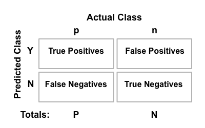
Figure 2. The confusion matrix
From the above numbers, the following can be calculated:
true positive rate: \(TPR = \frac{positives\ correctly \ classified}{total\ positives} = \frac{TP}{P}\)
false positive rate: \(FPR = \frac{negatives\ incorrectly\ classified}{total\ negatives} = \frac{FP}{N}\)
The receiver operating characteristic (ROC) curve is a two dimensional graph in which the false positive rate is plotted on the X axis and the true positive rate is plotted on the Y axis. The ROC curves are useful to visualize and compare the performance of classifier methods (see Figure 1).
Figure 3 illustrates the ROC curve of an example test set of 18 entities (7 actives, 11 decoys) that are shown in Table 1 in the ascending order of their scores. For a small test set, the ROC curve is actually a stepping function: an active entity in Table 1 moves the line upward, while a decoy moves it to the right.
id |
score |
active/decoy |
id |
score |
active/decoy |
|---|---|---|---|---|---|
O |
0.03 |
a |
L |
0.48 |
a |
J |
0.08 |
a |
K |
0.56 |
d |
D |
0.10 |
d |
P |
0.65 |
d |
A |
0.11 |
a |
Q |
0.71 |
d |
I |
0.22 |
d |
C |
0.72 |
d |
G |
0.32 |
a |
N |
0.73 |
a |
B |
0.35 |
a |
H |
0.80 |
d |
M |
0.42 |
d |
R |
0.82 |
d |
F |
0.44 |
d |
E |
0.99 |
d |
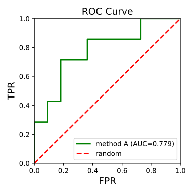
Figure 3. Example of ROC curve
The following code snippet shows how to calculate the true positive and false positive rates for the plot shown in Figure 3. The get_rates function takes the following parameters:
- actives
A list of id of actives. In our simple example of Table 1 the actives are: [‘A’, ‘B’, ‘G’, ‘J’, ‘L’, ‘N’, ‘O’]
- scores
A list of (id, score) tuples in ascending order of the scores.
It generates the tpr and fpr values, i.e. the increasing true positive rate
and false positive rate, respectively.
Alternatively, the tpr and fpr values can be calculated
using the sklearn.metrics.roc_curve() function.
See example in Plotting ROC Curves of Fingerprint Similarity.
Note
In this simple example the scores are in the range of [0.0, 1.0], where the lower the score is the better. For different score range the functions have to be modified accordingly.
def get_rates(
    actives: list[str], scores: list[tuple[str, float]]
) -> tuple[list[float], list[float]]:
    """Compute true positive and false positive rates."""
    tpr = [0.0]
    fpr = [0.0]
    num_actives = len(actives)
    num_decoys = len(scores) - num_actives

    found_actives = 0.0
    found_decoys = 0.0
    for mol_id, _score in scores:
        if mol_id in actives:
            found_actives += 1.0
        else:
            found_decoys += 1.0

        tpr.append(found_actives / float(num_actives))
        fpr.append(found_decoys / float(num_decoys))

    return tpr, fpr
The following code snippets show how the image of the ROC curve (Figure 3) is generated from the true positive and false positive rates calculated by the get_rates function.
def depict_roc_curve(
    actives: list[str],
    scores: list[tuple[str, float]],
    label: str,
    color: str,
    filename: str,
    random_line: bool,
) -> None:
    """Generate and save a ROC curve plot."""
    plt.figure(figsize=(4, 4), dpi=80)

    setup_roc_curve_plot()
    add_roc_curve(actives, scores, color, label)
    save_roc_curve_plot(filename, random_line)
def setup_roc_curve_plot() -> None:
    """Configure ROC curve plot axes and title."""
    plt.xlabel("FPR", fontsize=14)
    plt.ylabel("TPR", fontsize=14)
    plt.title("ROC Curve", fontsize=14)
The AUC number of the ROC curve is also calculated
(using sklearn.metrics.auc()) and shown in the legend.
The area under the curve (AUC) of the ROC curve is an aggregate measure
of performance across all possible classification thresholds.
It ranges between \([0.0, 1.0]\).
The model with perfect predictions has an AUC of 1.0 while a model
that always gets the predictions wrong has an AUC value of 0.0.
def add_roc_curve(
    actives: list[str],
    scores: list[tuple[str, float]],
    color: str,
    label: str,
) -> None:
    """Add a ROC curve to the current matplotlib plot."""
    tpr, fpr = get_rates(actives, scores)
    roc_auc = auc(fpr, tpr)

    roc_label = f"{label} (AUC={roc_auc:.3f})"
    plt.plot(fpr, tpr, color=color, linewidth=2, label=roc_label)
def save_roc_curve_plot(filename: str, random_line: bool) -> None:
    """Save the ROC curve plot to a file."""
    if random_line:
        x = [0.0, 1.0]
        plt.plot(x, x, linestyle="dashed", color="red", linewidth=2, label="random")

    plt.xlim(0.0, 1.0)
    plt.ylim(0.0, 1.0)
    plt.legend(fontsize=10, loc="best")
    plt.tight_layout()
    plt.savefig(filename)
Usage
See Download section to download the script.
The following command will generate the image shown in
Figure 3 for
actives.txt and
scores.txt .
> python3 roc2img.py --actives actives.txt --scores scores.txt --image roc.svg
Discussion
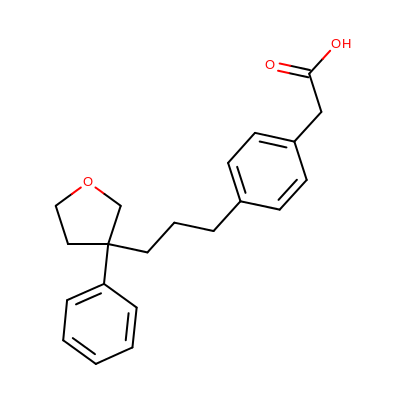
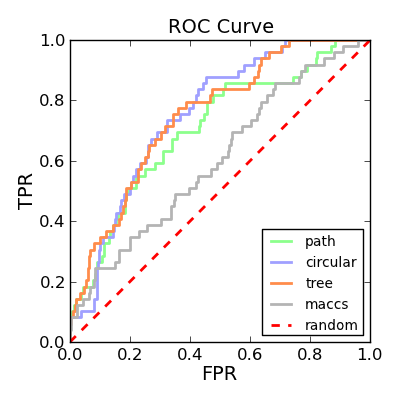
Depicting ROC curves is a good way to visualize and compare the performance of various fingerprint types. The molecule depicted on the left in Table 2 is a random molecule selected from the TXA2 set (49 structures) of the Briem-Lessel dataset. The graph on the right is generated by performing 2D molecule similarity searches using four of the fingerprint types of GraphSim TK (path, circular, tree and MACCS key). The decoy set is the four other activity classes in the dataset (5HT3, ACE, PAF and HMG-CoA) along with an inactive set of randomly selected compounds from the MDDR not known to belong to any of the five activity classes.
query |
ROC curves |
|
|
See also in matplotlib documentation
matplotlib.pyplot
See also in sklearn documentation
sklearn.metrics.auc()
See also
Theory
Binary classification in Wikipedia
Confusion matrix in Wikipedia
Receiver operating characteristic (ROC) in Wikipedia
An introduction to ROC analysis by Tom Fawcett
Area under the curve in Wikipedia
Briem-Lessel Dataset